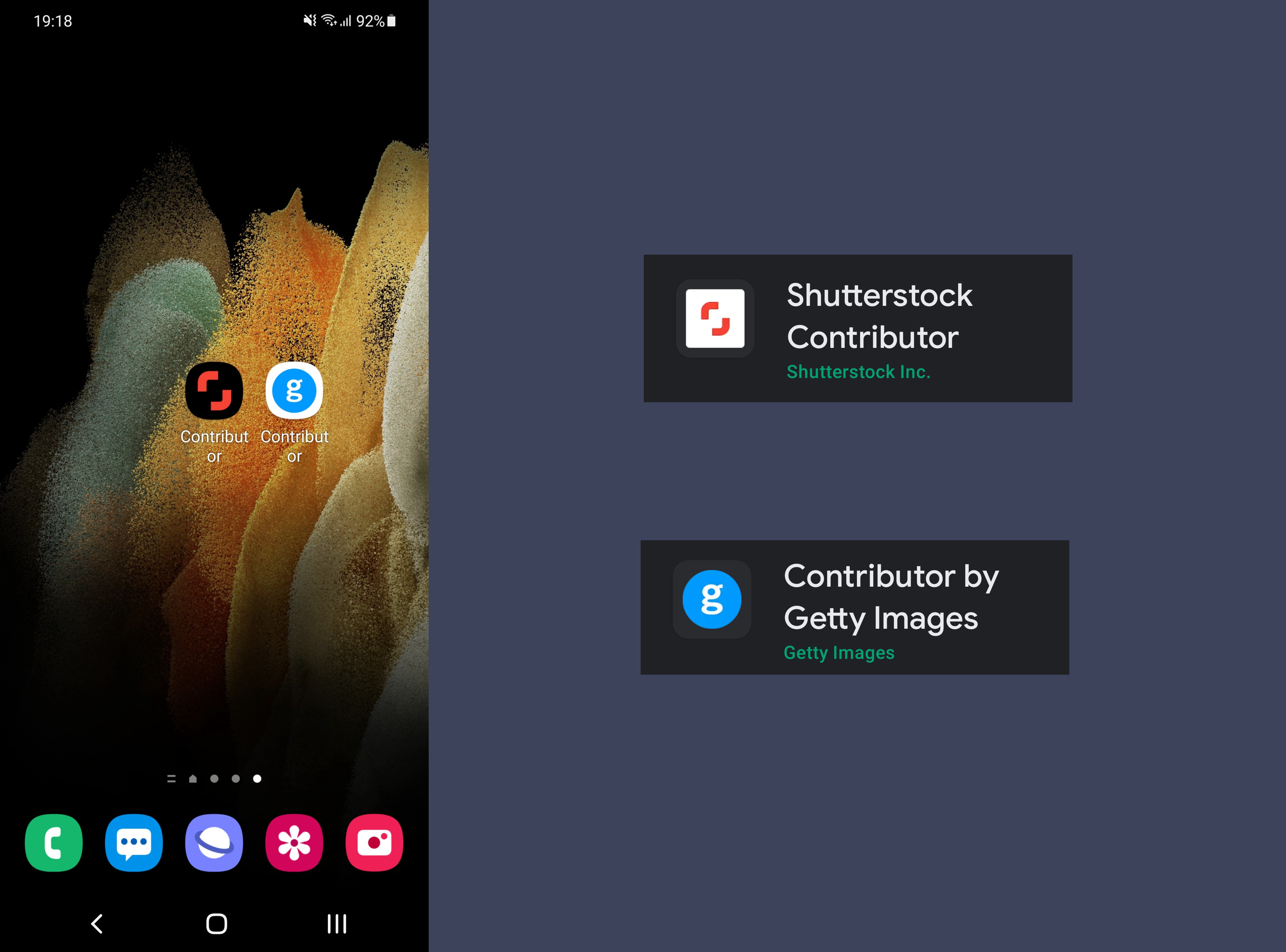
As a stock content creator, chances are that you are already using your mobile phone (or tablet) to earn money with your portfolio. However, if you are just using your device for taking photos / videos, this article will provide you with some suggestions on how to upload your content and track your earnings by using a smartphone app. We are going to briefly review the apps that Getty and Shutterstock offer, which should convince you to begin using them to optimize your workflow. If you’re already using the app, you may also discover some new features.
Apps limitations
Starting with upload limits, both apps can be used for uploading photos only, not videos.
However, there is a difference between the two though. Let’s see a comparison chart:
| Feature | Getty | Shutterstock |
|---|---|---|
| Videos upload | no | no |
| Photos upload | yes | yes |
| Editorial photos | yes | no |
| Illustration | yes | no |
| Releases | yes | yes |
| Description | yes | yes |
| Keywords | yes | yes |
| Categories | yes (2 max) | no |
| Country | no | yes |
| Date | no | yes |
Shutterstock requires that you add a City, Country-Date designation for editorials, but there is no tab on the app for these categories on creative uploads.
App installation
Both apps can be downloaded for Android and iOS for free, working on both smartphones and tablets. Be sure to use the links and download the apps for contributors, not buyers. You need not worry if you have an older device, check the versions below.
Here are the download links to the official stores:
Android (Android 5.0 and up)
iOS (iOS 12.4 or later)
Contributor by Getty Images (14 languages supported)
Shutterstock Contributor (21 languages supported)
You naturally need to connect using your contributor’s user name and password credentials.
Ratings
It is interesting to see how users rate each app on the different ecosystems. (1-5 scale)
| System | Shutterstock | Getty |
|---|---|---|
| Android | 4.6 | 3.9 |
| iOS | 4.4 | 2.3 |
Android users tend to be kinder it seems! Shutterstock wins with a 4.5 average vs 3.1 for Getty. However, if you read through the comments, you can soon understand that many users rate based on how their content is rejected, not on the app usability. Or perhaps disappointment at 10 cent downloads since June 2020 plays it’s role.
Also, on Android, the Shutterstock app has been installed 10 times more at over 1,000,000 vs over 100,000 for Getty. It is fair to say this means less reviews for the latter, naturally.
Comparative user experiences
We will use the Android version in each app for the shake of our review, but things work in essence the same at iOS too. Shutterstock has 4 main tabs and Getty 5. Let’s see them in details.
Shutterstock Contributor
Home tab
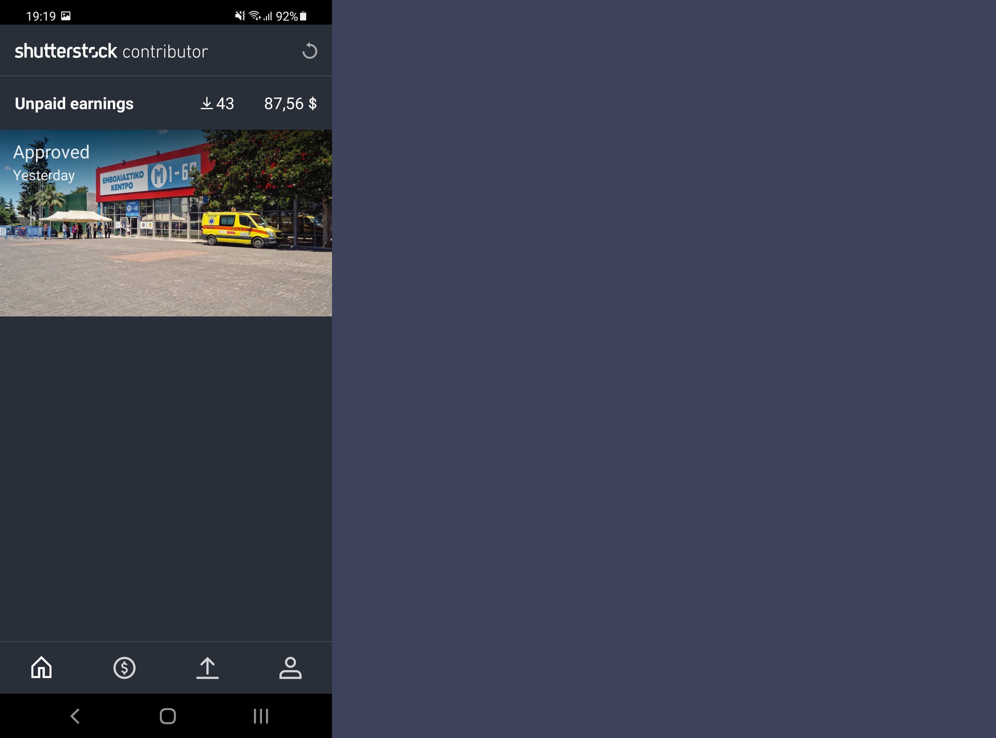
The interface displays on top the number of unpaid earnings (do not confuse that with monthly earnings) with the amount of unpaid earnings next to it.
At the same page you see screenshots of your latest approved or rejected photos, with a relevant date stamp. The tablet option does not display any more content or info here.
Earnings
Earnings tab in the Shutterstock app
On the phone you see a layout that goes as Year, Month (number of downloads earnings). You can scroll down to reach the first submission you ever made. There is no option to export these statistics.
The tablet version offers more details here. It goes as Year with month (number of downloads earnings), but adds a calendar of the selected month. You can click there on a selected date and this reveals at the same page a daily info of the total sales you had, along with earnings.
Useful detail: scroll left on tablet to see the past months, scroll down on phone for the same feature.
You can see the unique number your photo is assigned with the number of downloads it had and the earnings it got. Once you click on each photo, you go to a new page that details the date the picture was added, along with the total number of downloads and earnings it acquired.
The tablet version wins big on ease vs the phone here. Hit back to return to Earnings.
Edit, Upload and Submit content
Edit, Upload and Submit views of the Shutterstock app
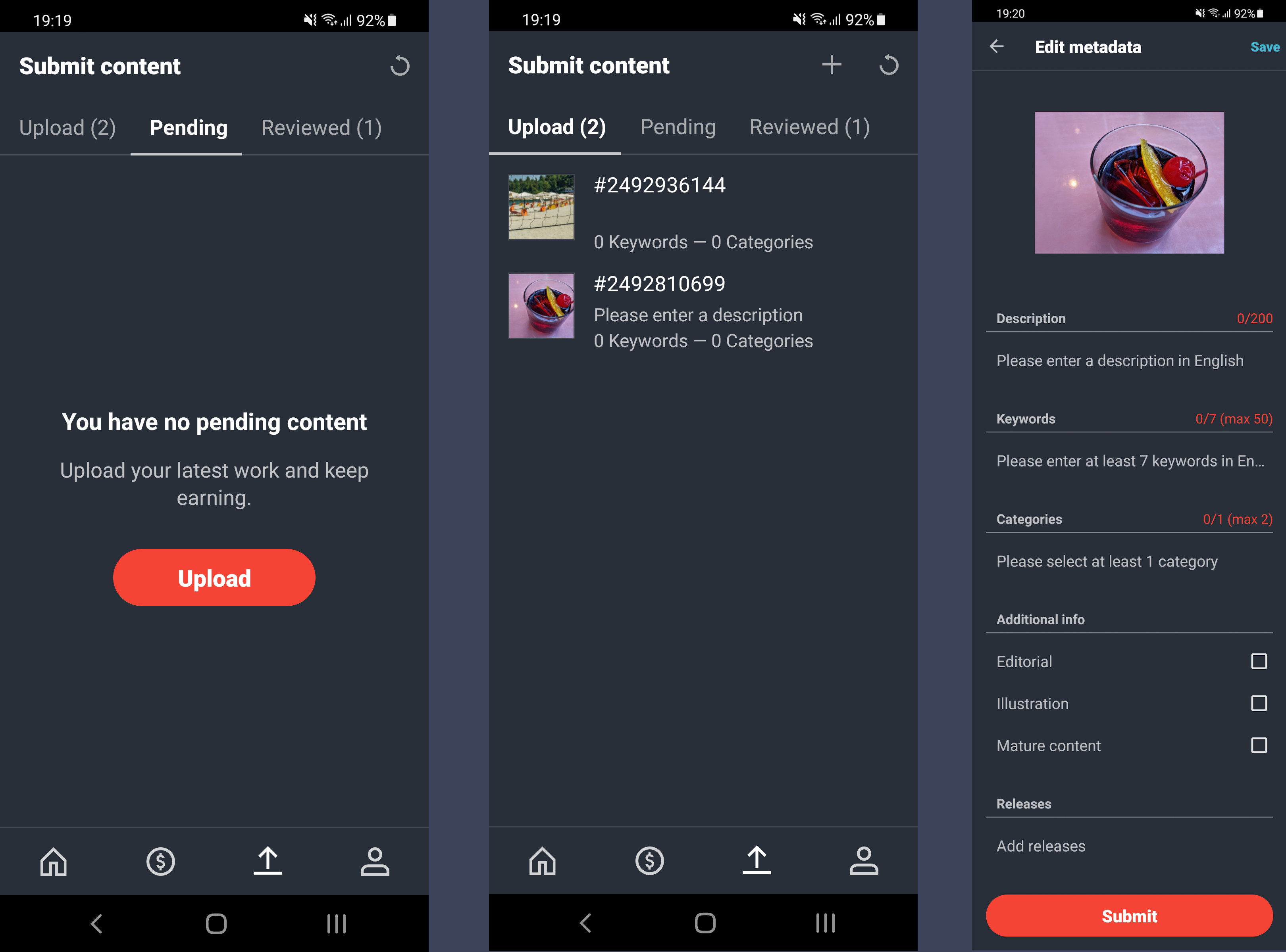
Submit content tab has 3 sub-categories:
- Upload
- Pending (Displays the photos that are not reviewed yet)
- Reviewed (Displays for 21 days the Approved or Rejected photos)
You touch the + sign to select an image from Camera or Gallery.
Tip 1: Always remember to check your Wi-Fi or data status, to avoid being overcharged by your mobile provider, especially when traveling abroad.
Tip 2: What you upload via the mobile phone, mirrors on the tablet so you can easily edit prior to sending for review. You can always finish editing a photo later, via a web browser.
Upon uploading completion, the photo is assigned a #number and it already asks for a description and states it has 0 keywords and 0 categories.
Once you click on it, you can Edit Metadata. It goes like: Description 0-200 (in English), Keywords up to 50 (7 minimum), Categories (at least one of 2), Releases and few other fields. If you hit Add releases, the new tab appears with all the model releases you have uploaded in the past, so this is a welcomed addition, when mobile. Don’t forget to Save and move back.
More
Additional functionality in the Shutterstock app
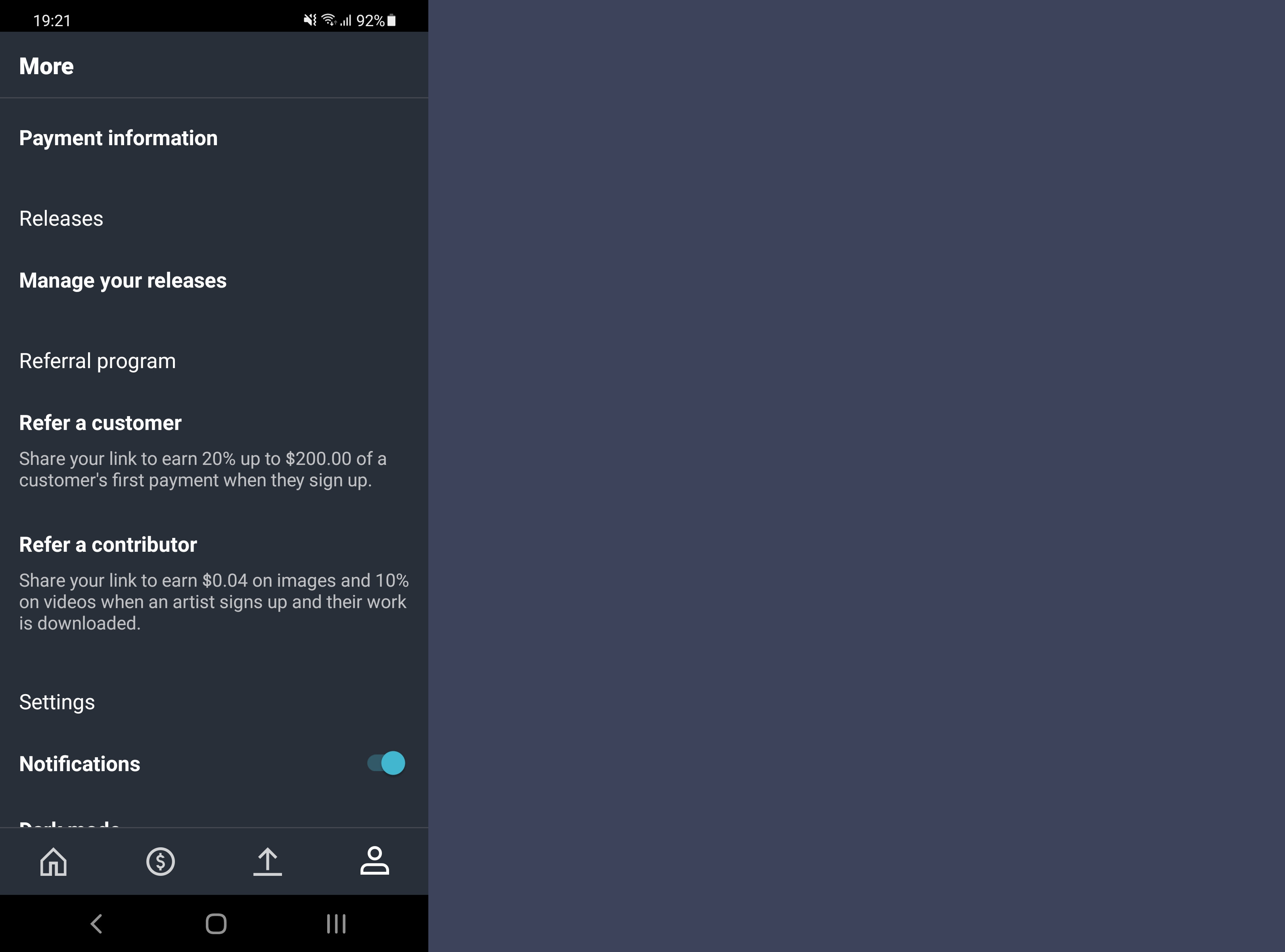
Here are the most details you would like to see.
Your portfolio
On top appears your portfolio with the total number of images. Click on it to see them in date descending order.
Published sets.
The above is true when you go back and click on your published sets.
Payment Information
Does nothing here! It just takes you to the contributor website.
Releases
Manages your already uploaded model releases.
Refer a customer
Easily prepares a link to share a referral link to earn 20% up to $200.00 of a customer’s first payment when they sign up.
Refer a contributor
Shares your link to earn $0.04 on images and 10% on videos when an artist signs up and their work is downloaded.
Settings
Slide notifications to on (always having in mind potential mobile data charges) if you want to be informed on details like when you get a sale or if a photo is reviewed. Our experience tells us that it works with reviews but not always on sales.
Dark mode
Follows system theme. Enable if you are a fan of the dark themes.
The rest of the menu tabs here are of no particular benefit to the contributor. They merely consist of a series of tabs that lead to the official Shutterstock page, outside the app interface, like the terms of service, or follow links to Shutterstock’s social media accounts.
Let’s move to Getty now.
Contributor by Getty Images
After you log in, at the bottom of the page Getty has the following 5 options: Briefs, Just For You, Add Portfolio/Stats/Submissions, Sign In As. There is no difference at the interface, regardless if you are using a phone or a tablet. You get the same details, with a tablet being a glorified version of the phone interface.
Tip 1: What you upload via the mobile phone, mirrors on the tablet so you can easily edit prior to sending for review, like you can with Shutterstock. If you want to finish editing with a web browser, you have to log in to ESP, not QHero.
Let’s go through each tab with more details.
Briefs
Briefs tab in the Getty app
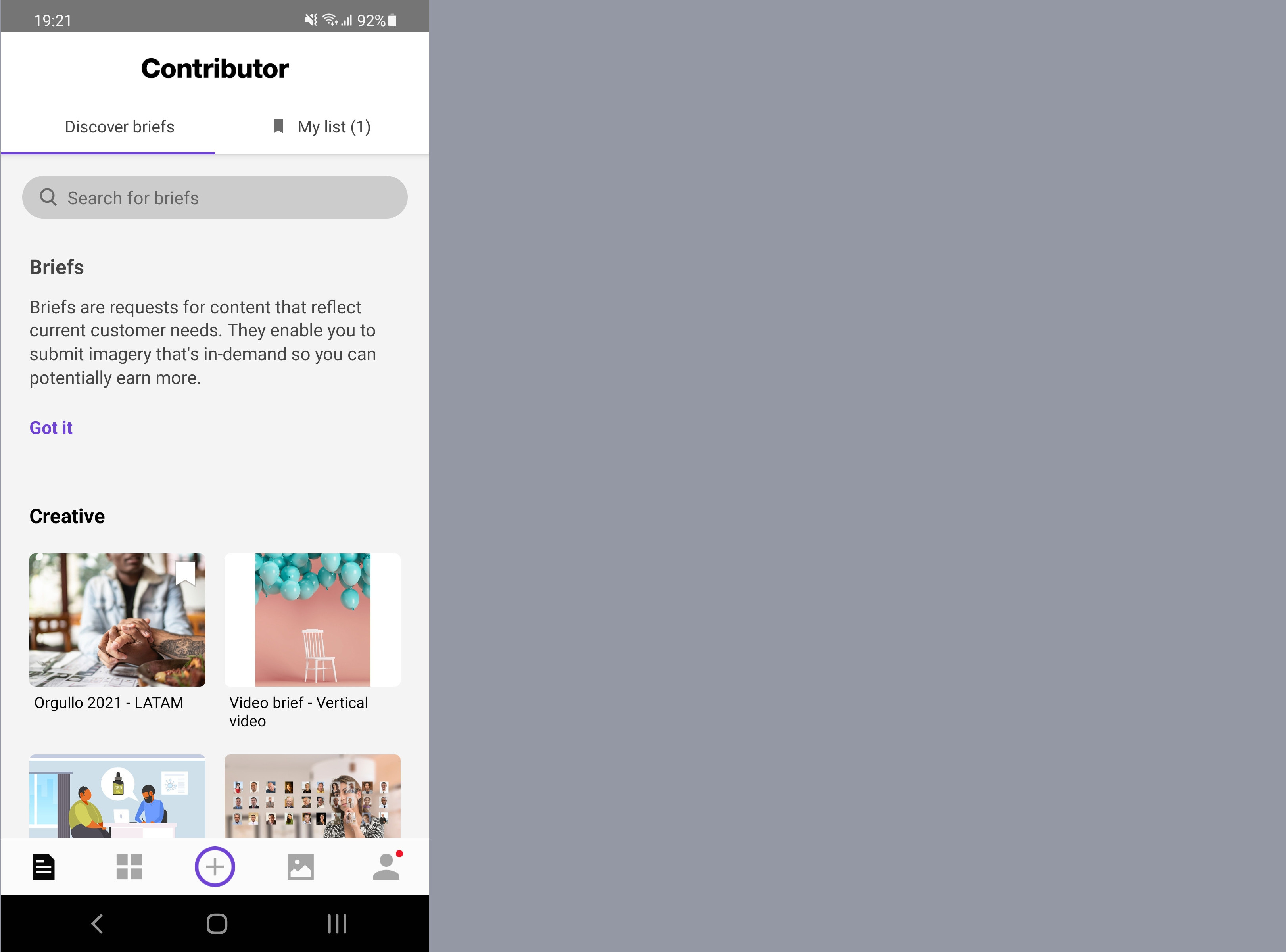
You can see all available requests by Getty Images and iStock. Click to expand more while you still remain at the mobile interface.
Detail: briefs might include video, which you need to upload via their web submission tool, which naturally takes you to the ESP submission page, where you need to login again.
You can save briefs to a list and easily recall via a bookmark at the top right of the app page.
Just For You
Your monthly views appear here, with a comparison of the same month last year. If you click See Full Stats you move to the tab with statistics, which we will see further down.
Messages
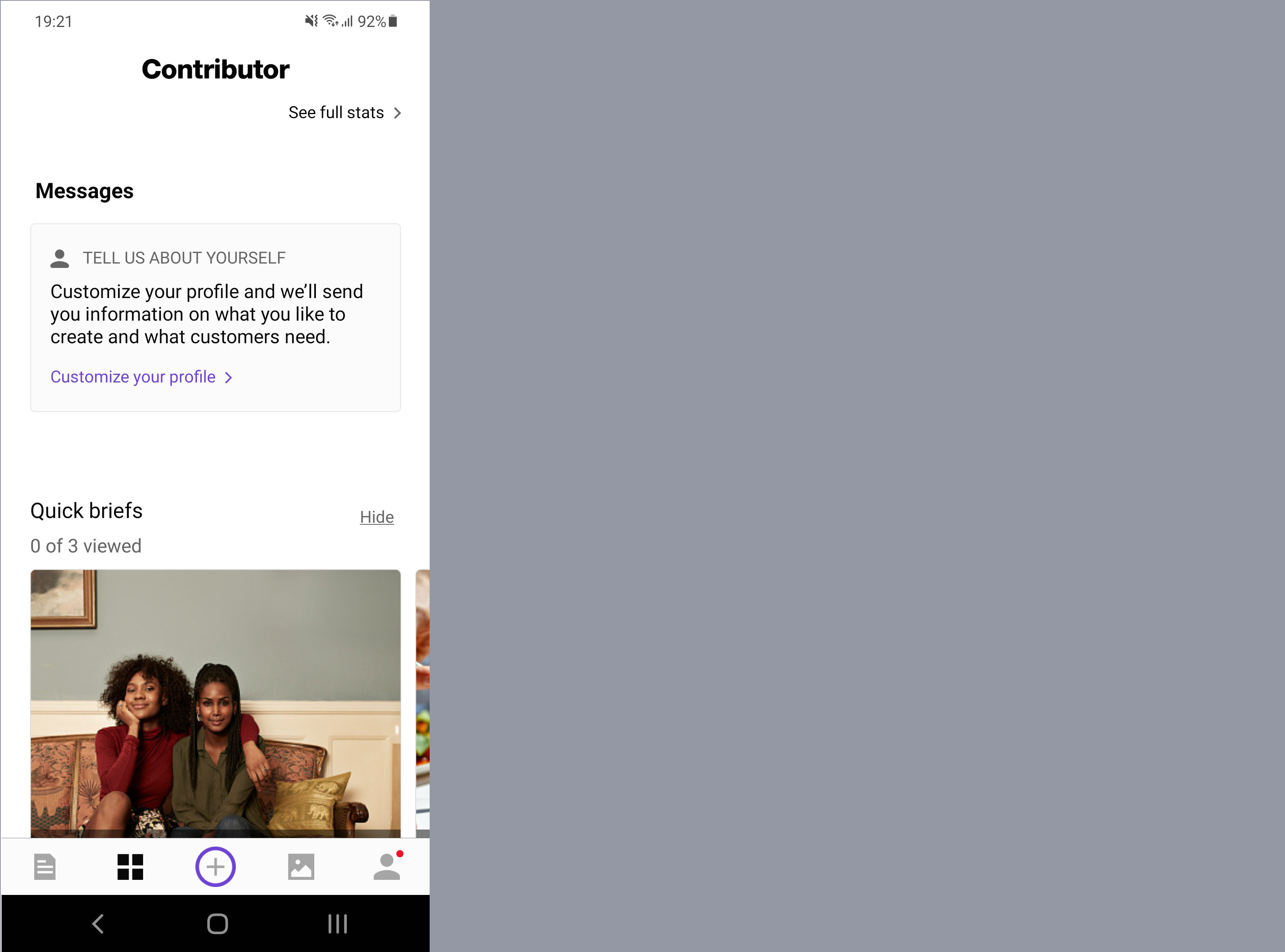
Messages tab in the Getty app
Includes an option to customize your profile and if you click it you answer to a couple of Getty questions so they can send you custom information on what to create, based on customers’ needs.
Add
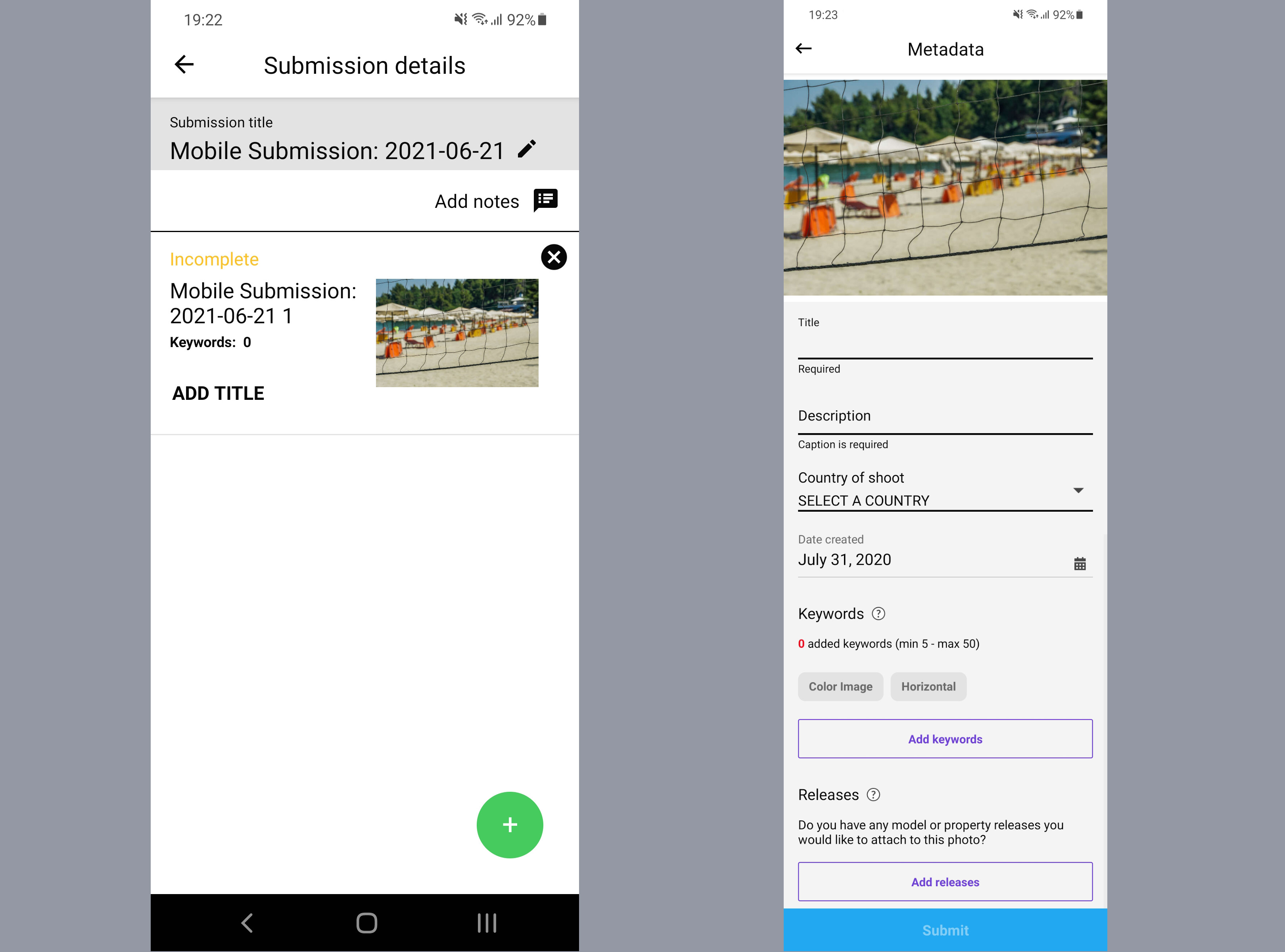
Process of adding photos in the Getty app
Like Shutterstock, you click + to all photos from your collection, be it either photos taken with mobile or not.
Portfolio / Stats / Submissions
Portfolio
Displays your total portfolio with an option to share a link or search it.
Stats
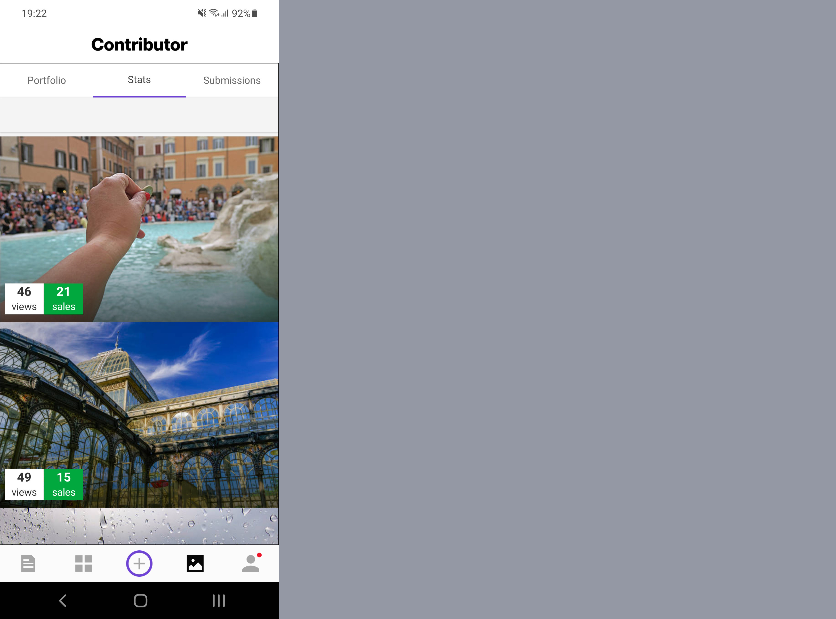
Earnings statistics in the Getty app
On top you see your lifetime view and sales. You can click on a particular month to see details. After about the 20th of each month, you can click on the previous month to see the number of sales, but not the amount it earned. For the current month, you can see the views which do not always result in sales.
Submissions
See your uploaded photos and check their acceptance or rejection status. Edit your mobile submission here. You need to add a title and description, with a minimum of 5 keywords. (max. 50). You can also add a date and country, or add releases if available. You can add notes to the reviewer.
If you hit Add Releases, you can add from a
- New photo (take it with mobile)
- Saved photos (leads to the phone gallery) or
- Documents (leads back to the phone gallery)
There is an easy color status:
- Orange: needs edits
- Green: reviewed and accepted
- Red: reviewed and needs revisions
Sign In As
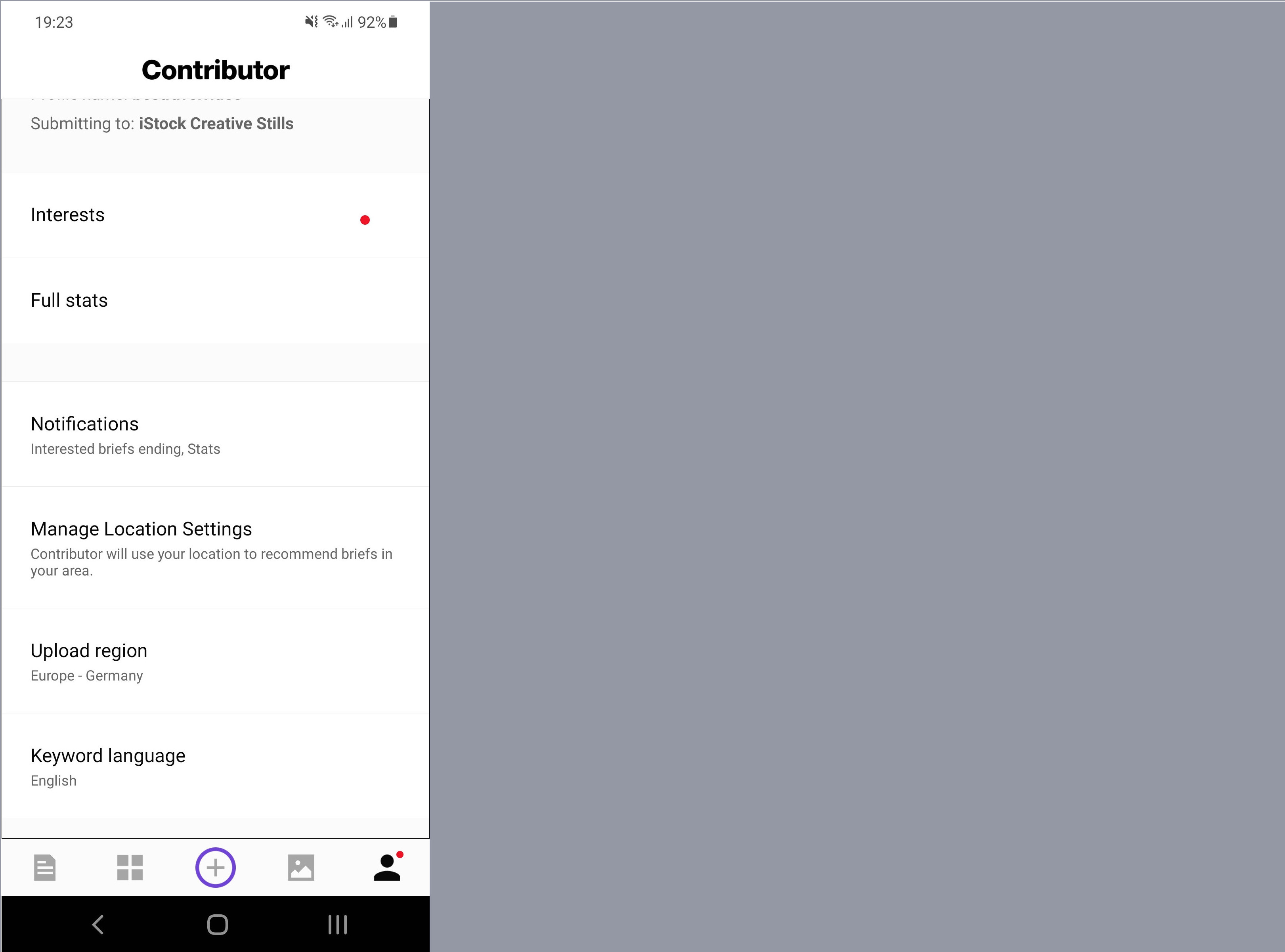
Sign in flow of the Getty app
Displays your contributor email, profile name and where are you submitting to, if it is only iStock creative Stills for example.
Like Shutterstock, there are also many tabs not of particular benefit to the contributor here, some again sending you outside of the app, to Getty web pages.
The following two might be worth seeing prior to uploading:
Manage Location Settings: Takes you to the Android interface so you can decide if your location is used to recommend briefs in your area.
Upload Region: An option to select from 7 different servers, ranging from US to South America and Europe to Asia.
Epilogue
That’s it! Remember that you can register via mobile on both apps.
Some users complain that their photos appear compressed. We have not been able to confirm that on Android but it might be true on iOS, if you use a photo not taken with your iPhone.
Both apps take you out of their interface because it is not easy to dynamically change content all the time. Even if you are just using them to track your earnings, it is still faster and less data and time consuming than having to log in to a browser from time to time.
One one hand, Getty has more options with briefs, and on the other, Shutterstock has more notifications on earnings, since it does not report monthly.
Nevertheless, if you are a new user, you might find some of the features useful. Or you might be a current user and you now found out a new feature.
Suggestions
Both apps may add an option to select a monthly for Getty or short time interval for Shutterstock that could include a sound and a pop up that will inform about earnings.
However, none of the two apps reads metadata on already edited pics. You have to write them separately, if you are uploading from mobile.
Xpiks comes to the rescue
Here is where Xpiks can aid you, if you are using a desktop or Laptop computer.
Xpiks perfectly saves metadata recognized by all major agencies.

Xpiks with photo metadata
Also Xpiks allows you to upload with one click to all selectable agencies, once you save your credentials on each agency.
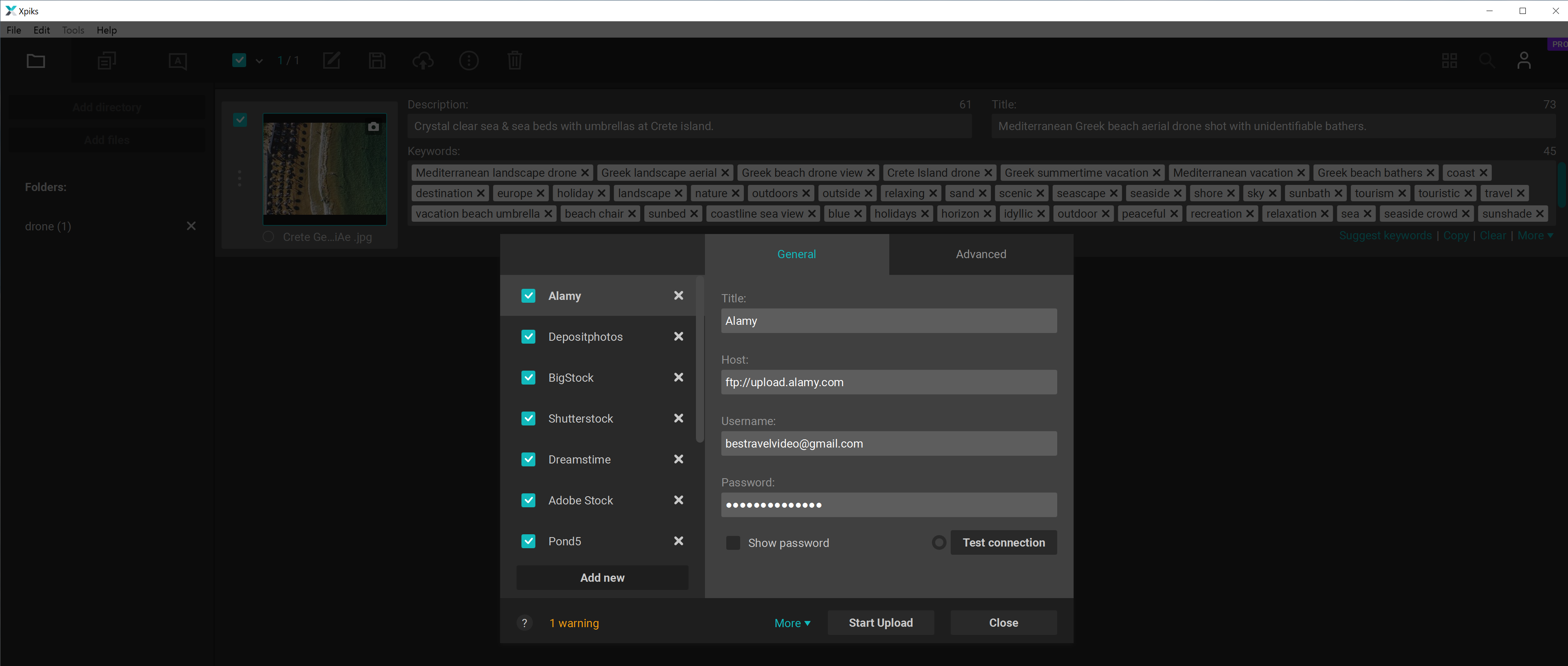
Xpiks upload

